Readability is part of the challenge
An arcade survival game often asks players to move, avoid enemies, collect rewards and choose upgrades while the screen grows busier. Difficulty can come from making those decisions quickly. It is less satisfying when a player cannot tell what is dangerous, where their character is or whether an attack connected. Visual hierarchy is the design of what gets noticed first, second and third. In a crowded arena, it helps players spend their attention on decisions rather than deciphering the image.
A useful starting point is to list what the player must recognize during a tense moment. The player character, nearby threats and safe movement routes usually deserve immediate attention. Experience drops, damage numbers and background decoration may matter, but they rarely need equal prominence. This order can change with the game’s rules: if a pickup expires quickly, for example, players may need to spot it sooner. The goal is not a sparse screen. It is a screen whose busiest moments still communicate priorities.
Give different threats different visual jobs
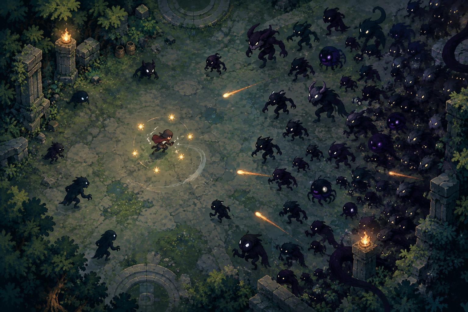
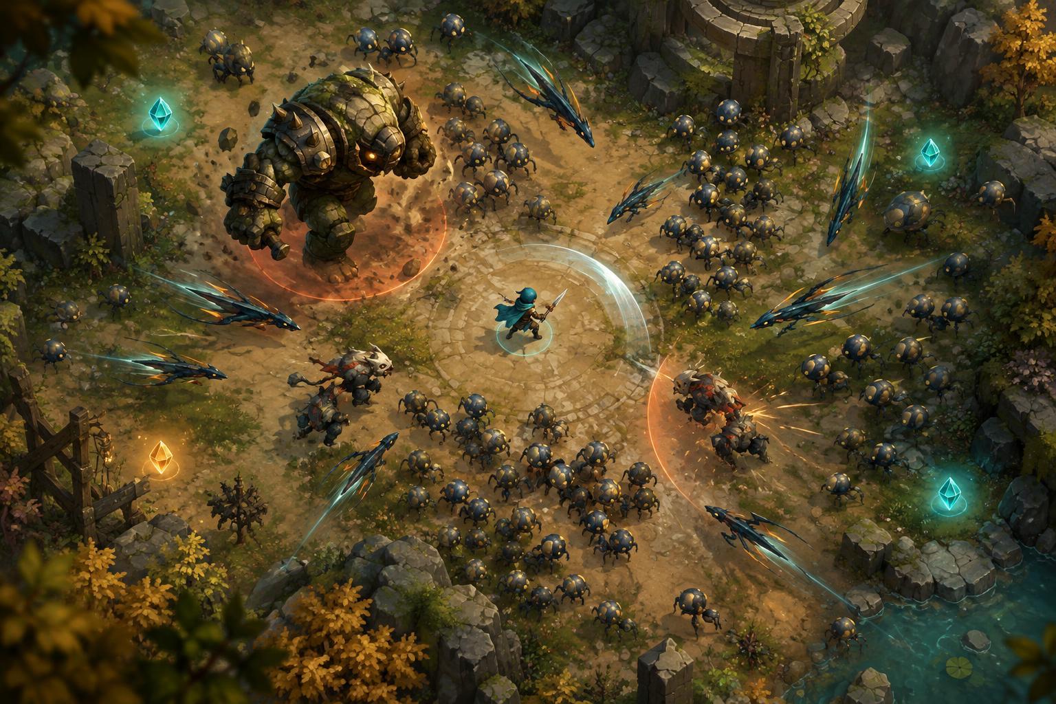
When many enemies share similar colors, sizes and movement patterns, players may see only a single moving mass. Distinct silhouettes can help them identify which shapes block a route, charge forward or attack from a distance. Shape matters alongside color because lighting, overlapping effects and individual differences in color perception can make hue alone unreliable. A larger outline, a recognizable posture or a different movement rhythm can convey a role before the player reads a label.
Consistency is as important as distinction. If one sharp-looking effect marks a harmful projectile, other harmful projectiles should not look like harmless decorations. Repeated visual rules let players learn what they are seeing during play. Designers can reserve their strongest contrast for the threats that require the fastest response, rather than giving every enemy and object the same bright outline. When everything demands attention, the hierarchy disappears.
Control the visual cost of attacks and rewards
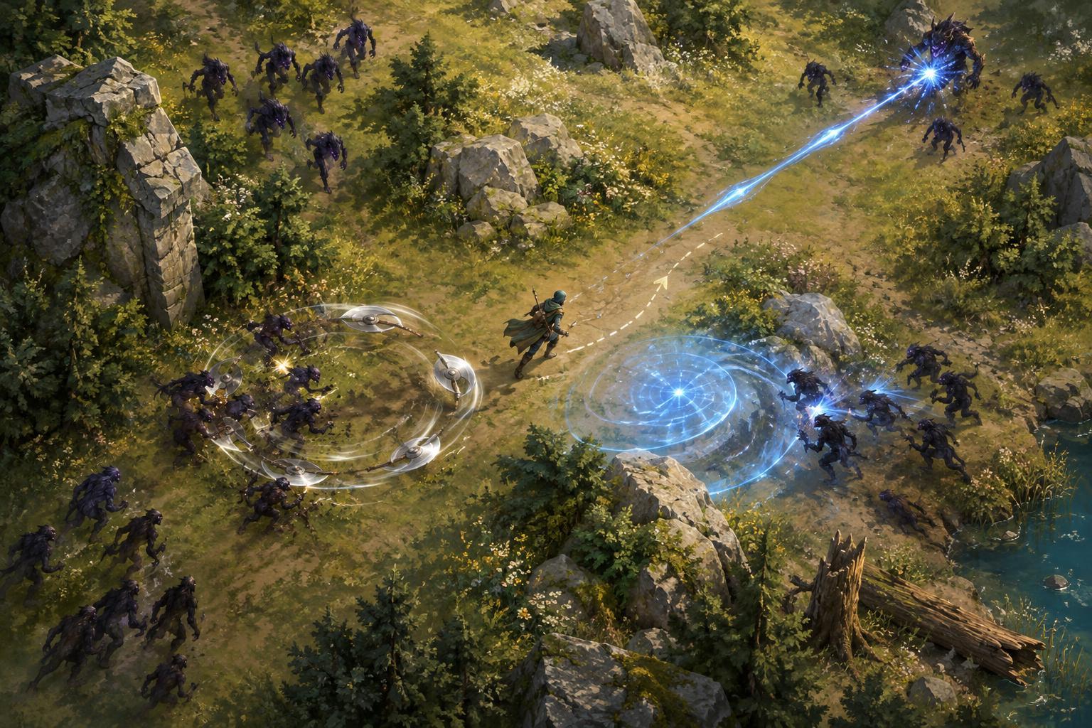
A powerful build should feel powerful, but its effects can obscure the information needed to survive. Large flashes, lingering particles and overlapping area attacks may cover enemy edges or the player’s position. One approach is to make an effect most prominent at the moment it communicates an event, then let it fade or become less opaque. The initial burst can signal that an ability triggered; it need not hide the arena for the full duration of the attack.
Pickups present a related problem. If every dropped item glows as strongly as an incoming hazard, rewards compete with warnings. Designers can distinguish pickups through stable shapes and restrained animation, saving more urgent motion for imminent danger. Collecting an item should still produce clear feedback, such as a brief sound or visual response, so players know what happened. The distinction is between information that needs to be noticed now and information that can remain visible until the player has room to act.
Make feedback useful without filling the screen
Players need to know when they take damage, defeat a target or trigger a defensive effect. Yet stacking numbers, text and flashes on every interaction can make the next threat harder to see. Feedback works best when it answers a specific question. A brief response on the player character can answer “Was I hit?” A clear change in an enemy can answer “Did that attack work?” Not every small hit needs the same visual weight as a major event.
The placement of feedback also matters. Information that follows moving objects can overlap the action, while a fixed interface element may pull the eye away from it. A design can divide these jobs: immediate, short-lived cues near the event and persistent information in a consistent screen location. If sound carries some feedback, essential information should still have a visible counterpart for players who cannot hear it or prefer to play without audio.
Test at the busiest moment, not just the beginning
A visual system that looks clear with three enemies may fail when a build produces frequent attacks and the arena fills with drops. Testing should include dense, ordinary gameplay rather than only staged screenshots. Watch whether a player can locate their character, identify a nearby hazard and find an escape route without pausing. If they repeatedly miss the same cue, consider whether its contrast, shape, timing or position is being overwhelmed.
Changes are easier to judge when made one at a time. Reducing particle duration, changing a projectile silhouette or calming pickup animation may each improve clarity, but changing all three together makes the result harder to interpret. Readability does not require removing spectacle. It means deciding which moments deserve spectacle and protecting the information players need between them. A crowded screen can then feel demanding for the right reason: there are meaningful choices to make, and players can see enough to make them.